 Coding Rhodes
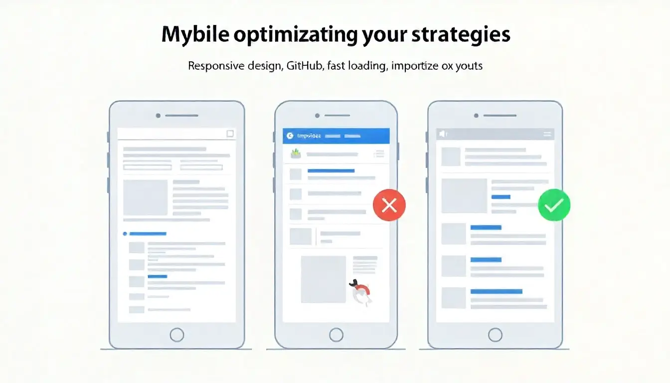
Mobile Optimization Strategies for GitHub-Hosted Websites
As mobile usage continues to dominate internet traffic, ensuring your GitHub-hosted website is optimized for smartphones and tablets is essential. Poor mobile performance can lead to higher bounce rates, lower search rankings, and missed opportunities on Google Discover. In this detailed guide, we will explore actionable mobile optimization strategies for GitHub hosting, including responsive design, performance enhancements, accessibility improvements, and best practices to deliver a seamless mobile experience.
Introduction: Why Mobile Optimization Matters on GitHub Hosting
GitHub hosting, through GitHub Pages, provides a reliable and cost-effective platform for serving static websites. While it excels at hosting blogs, portfolios, project documentation, and business sites, optimization is not automatic. For today’s mobile-first world, optimizing for smartphones is not optional—it’s critical.
Key reasons mobile optimization matters:
- Google Mobile-First Indexing: Google indexes and ranks websites based on their mobile versions.
- User Experience: More than 60% of traffic comes from mobile devices.
- Google Discover Visibility: Fast, mobile-friendly pages are prioritized in Discover feeds.
- Conversion Rates: Businesses see higher engagement when sites are designed for mobile use.
Understanding GitHub Hosting Limitations and Opportunities
GitHub Pages supports only static websites—HTML, CSS, JavaScript, and static assets like images. This means:
- You cannot use server-side technologies (e.g., PHP, MySQL).
- Optimization must rely on front-end improvements.
- Performance and responsiveness depend on design and coding practices.
Opportunity: Since GitHub hosting leverages global CDNs, content delivery is already efficient. The challenge lies in designing and coding for mobile.
Core Mobile Optimization Strategies for GitHub-Hosted Sites
1. Implement Responsive Web Design
- Use flexible grids and layouts (CSS Grid, Flexbox).
- Apply media queries to adjust content based on screen size.
- Ensure touch targets (buttons, links) are large enough for mobile users.
Example CSS:
body {
  font-family: Arial, sans-serif;
  margin: 0;
  padding: 0;
}

.container {
  display: flex;
  flex-direction: column;
  padding: 16px;
}

@media (min-width: 768px) {
  .container {
    flex-direction: row;
  }
}
2. Optimize Page Load Speed
- Compress images using WebP or AVIF formats.
- Minify CSS and JavaScript.
- Enable lazy loading for images with
loading="lazy". - Reduce external scripts (analytics, ads, fonts).
3. Use Mobile-Friendly Typography
- Ensure font sizes scale with
remorvwunits. - Maintain at least 16px base font size.
- Provide sufficient line spacing (1.5–1.8).
4. Simplify Navigation for Mobile Users
- Use collapsible menus (hamburger navigation).
- Provide sticky navigation bars.
- Ensure links and buttons are easy to tap.
5. Prioritize Core Web Vitals on Mobile
- Largest Contentful Paint (LCP): Optimize above-the-fold images.
- First Input Delay (FID): Minimize JavaScript execution.
- Cumulative Layout Shift (CLS): Reserve space for ads, images, and dynamic elements.
6. Enable Touch-Friendly Interactions
- Avoid hover-only features.
- Provide clear feedback (highlight buttons when tapped).
- Ensure forms are easy to fill out with larger input fields.
Best Practices for Mobile SEO on GitHub Hosting
Meta Tags for Mobile
Add viewport settings for responsive scaling:
<meta name="viewport" content="width=device-width, initial-scale=1">
Structured Data for Mobile Discoverability
Implement schema markup (Article, FAQ, Breadcrumb) to help Google display rich results.
Optimize for Voice Search
Mobile users often rely on voice queries. Use natural language in headings and FAQs.
Mobile-Friendly Content Formatting
- Short paragraphs (2–3 sentences each).
- Use bullet points and subheadings.
- Add descriptive alt text for all images.
Accessibility Considerations
A mobile-optimized site should also be accessible:
- Provide high contrast between text and background.
- Ensure images have descriptive alt text.
- Enable keyboard navigation.
- Use ARIA roles for screen readers.
Tools to Test Mobile Optimization
- Google Mobile-Friendly Test – Confirms mobile compatibility.
- Google PageSpeed Insights – Reports Core Web Vitals for mobile.
- Lighthouse (Chrome DevTools) – Provides in-depth mobile performance analysis.
- GTmetrix – Measures speed and loading times globally.
Automating Mobile Optimization with GitHub Actions
GitHub Actions can streamline optimization:
- Minify CSS and JS during build.
- Compress images automatically.
- Run Lighthouse audits on every push.
Example workflow snippet:
name: Optimize Mobile Performance
on: [push]
jobs:
  build:
    runs-on: ubuntu-latest
    steps:
      - uses: actions/checkout@v2
      - name: Install Dependencies
        run: npm install -g minify imagemin-cli
      - name: Minify Files
        run: |
          minify *.html -o ./dist
          minify *.css -o ./dist
          minify *.js -o ./dist
      - name: Compress Images
        run: imagemin images/* --out-dir=dist/images
Case Study: Mobile Optimization on a GitHub-Hosted Portfolio
A developer hosted their portfolio on GitHub Pages. Initially, the site had:
- Large uncompressed images
- Poor navigation on mobile
- Slow loading times
After implementing mobile optimization:
- Load speed improved from 6s to 2s.
- Mobile bounce rate decreased by 40%.
- Portfolio impressions on Google Discover increased significantly.
Advanced Mobile Optimization Strategies
Preload Key Resources
- Use
<link rel="preload">for fonts and critical CSS.
AMP (Accelerated Mobile Pages)
- While AMP is optional, creating lightweight, fast-loading AMP pages can improve Discover chances.
Progressive Web Apps (PWA)
- Turn your GitHub-hosted site into a PWA for app-like performance on mobile.
Image CDN Integration
- Pair GitHub hosting with a CDN (e.g., Cloudflare, Netlify CDN) to deliver optimized images.
Maintaining Long-Term Mobile Performance
- Audit your site monthly with Lighthouse.
- Optimize new images before uploading.
- Keep dependencies minimal.
- Monitor structured data and Core Web Vitals.
- Stay updated with Google’s mobile SEO guidelines.
Conclusion
Mobile optimization is vital for GitHub-hosted websites to remain competitive in today’s search environment. By focusing on responsive design, speed improvements, accessibility, and Core Web Vitals, you can create a seamless experience for mobile visitors. Implementing these strategies not only improves rankings but also boosts eligibility for Google Discover, ensuring your content reaches a wider audience.
Key Takeaways
- GitHub hosting supports mobile optimization through front-end best practices.
- Responsive design, fast loading, and simplified navigation are key.
- Automating performance optimization via GitHub Actions saves time.
- Mobile SEO and accessibility improve visibility in Google Discover.
- Regular monitoring ensures long-term success.
 Using Analytics to Monitor Your GitHub Pages Performance